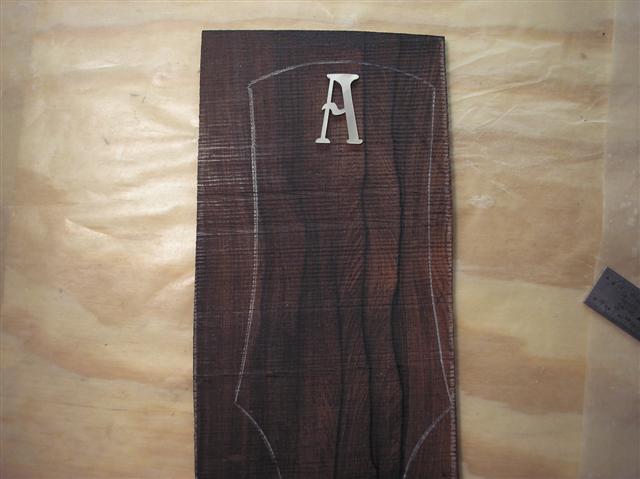
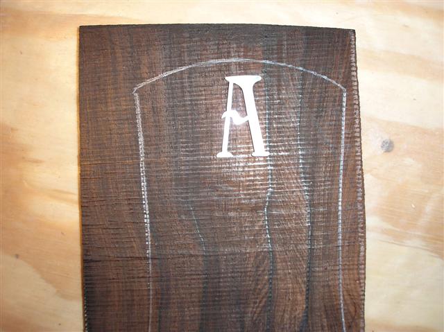
This "A" logo that I had Andy DePaule cut, is a bit too large for my headstock overlay I think. What do you guys say ? It's 1 and 1/8" tall.
| Official Luthiers Forum! http://www-.luthiersforum.com/forum/ |
|
| My Logo.... http://www-.luthiersforum.com/forum/viewtopic.php?f=10102&t=8724 |
Page 1 of 2 |
| Author: | Dave Anderson [ Sat Oct 07, 2006 1:09 am ] |
| Post subject: | |
This "A" logo that I had Andy DePaule cut, is a bit too large for my headstock overlay I think. What do you guys say ? It's 1 and 1/8" tall.
|
|
| Author: | Serge Poirier [ Sat Oct 07, 2006 1:15 am ] |
| Post subject: | |
Hi Dave, it looks good! |
|
| Author: | RCoates [ Sat Oct 07, 2006 1:22 am ] |
| Post subject: | |
Looks good. |
|
| Author: | Dave Anderson [ Sat Oct 07, 2006 1:40 am ] |
| Post subject: | |
Thanks , Ok Serge, Let me finish my cornflakes and I'll do it. 
|
|
| Author: | Serge Poirier [ Sat Oct 07, 2006 1:46 am ] |
| Post subject: | |
Dave, at first sight, it looked a bit big but after a second look, it looks like it will fit nicely, i'd say go with it bro! 
|
|
| Author: | Barry Daniels [ Sat Oct 07, 2006 1:56 am ] |
| Post subject: | |
It's a little hard to judge without seeing your tuner layout. Are you going to bind your headstock? |
|
| Author: | Dave Anderson [ Sat Oct 07, 2006 1:58 am ] |
| Post subject: | |
Oh, I see you edited your post Serge.OK Thanks, Ronn and Hesh |
|
| Author: | Dave Rector [ Sat Oct 07, 2006 1:59 am ] |
| Post subject: | |
Looks good to me Dave! BTW, is that a MadRose headstock overlay? |
|
| Author: | Andy Zimmerman [ Sat Oct 07, 2006 2:01 am ] |
| Post subject: | |
I think it looks great. It is NOT too big |
|
| Author: | Dave Anderson [ Sat Oct 07, 2006 2:09 am ] |
| Post subject: | |
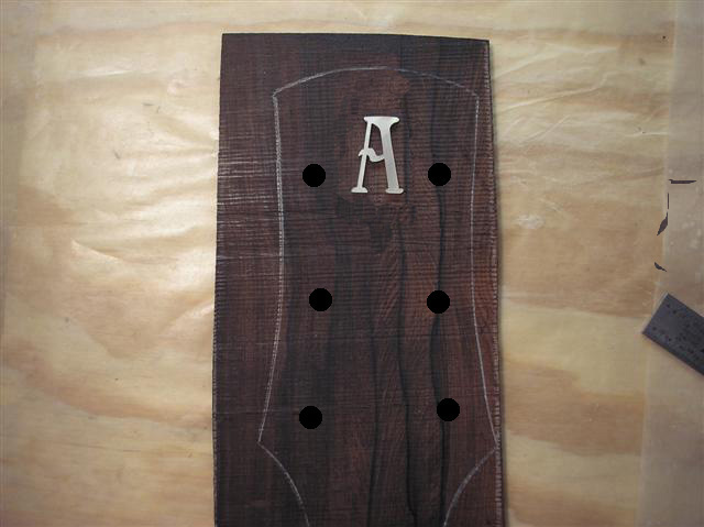
Thats a BRW overlay Dave that I got from Steve R.(Colonial). Barry ,No I'm not binding this one. I checked the spacing for the tuner posts and the "A" fits in between ok. |
|
| Author: | Sam Price [ Sat Oct 07, 2006 2:16 am ] |
| Post subject: | |
Looks fine. |
|
| Author: | peterm [ Sat Oct 07, 2006 2:47 am ] |
| Post subject: | |
Go for it!! It looks good! |
|
| Author: | CarltonM [ Sat Oct 07, 2006 3:15 am ] |
| Post subject: | |
Dave, I think the size is good, but you might try moving it down from the top edge a bit. It'd give better overall visual balance, IMO. |
|
| Author: | Don Williams [ Sat Oct 07, 2006 3:25 am ] |
| Post subject: | |
Ok, Grumpy Olf Fart here...with a different take. I personally think it's a bit tall. If you add binding and purfling to it, and then tuners, it may risk being out of balance with the proportions of the top part of the headstock. But this is a very personal thing, and when all's said and done, it's your decision and you have to be happy with the end product. |
|
| Author: | Joe Beaver [ Sat Oct 07, 2006 3:54 am ] |
| Post subject: | |
It is a good looking logo Dave. If it was me I'd use it but consider having more make a tad smaller, especially if you are going to bind a headplate or do a purfling line. You might consider something around 5/8". Play with the one you have in photoshop.... |
|
| Author: | James Orr [ Sat Oct 07, 2006 3:55 am ] |
| Post subject: | |
I was going to say what Carlton said. Double the space it has currently, or give it another 2/3rds of what you have currently, and it should be just right. |
|
| Author: | Joe Beaver [ Sat Oct 07, 2006 4:25 am ] |
| Post subject: | |
I like what James and Carlton are saying... Move it down and it just might look perfect!!! 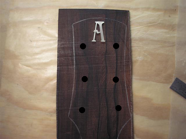
|
|
| Author: | Joe Beaver [ Sat Oct 07, 2006 4:35 am ] |
| Post subject: | |
Or Smaller... 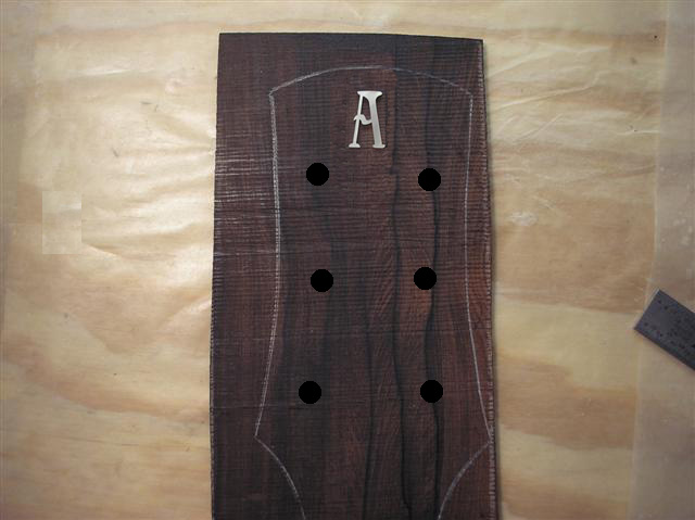
|
|
| Author: | Dave Anderson [ Sat Oct 07, 2006 5:25 am ] |
| Post subject: | |
Yep,you're right Don,Carlton,and James. I think lowering it and also making it just a tad smaller is the answer. I appreciate all the advice, everyone.And thanks for the Photoshop pics Joe.
|
|
| Author: | CarltonM [ Sat Oct 07, 2006 7:45 am ] |
| Post subject: | |
Dave, There was something else bothering me a little, and I just realized what it is. With the rounded crest on your headstock, you might consider putting a radius on the top of your "A," instead of the flat plane it has now. Just a thought. |
|
| Author: | John Mayes [ Sat Oct 07, 2006 8:23 am ] |
| Post subject: | |
I like the smaller version much better. I know of other builders who make some mighty fine guitars but they have a really large logo on the headstock. Very distracting IMO |
|
| Author: | Dave Anderson [ Sat Oct 07, 2006 10:13 am ] |
| Post subject: | |
Carlton, I see your point but I really like this A. I think I'm going to stick with it but smaller to about 3/4" or 7/8. It should be fine after lowering it some. I am going to do some more drawings and I will try some rounded A's. So who knows,I may end up changing it. Thanks a lot! |
|
| Author: | Joe Beaver [ Sat Oct 07, 2006 11:50 am ] |
| Post subject: | |
Don't mind me.... I just like to play. Side by side 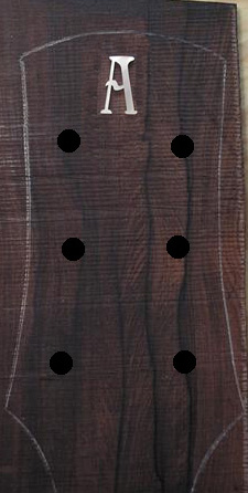 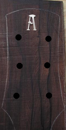
|
|
| Author: | CarltonM [ Sat Oct 07, 2006 12:36 pm ] |
| Post subject: | |
Joe, you speedy wizard! The rounded "A" is just what I'd envisioned, and I must say I like it better. Of course, there's nothing bad about the original, so I think Dave's okay whichever way he goes. Joe, you may end up as our official "thought-made-manifester!" |
|
| Page 1 of 2 | All times are UTC - 5 hours |
| Powered by phpBB® Forum Software © phpBB Group http://www.phpbb.com/ |
|